UX/UI Basics: Why a Bad Experience Costs More Than You'd Think
UX and UI aren't the same — and the difference concretely affects where you should invest. A beautiful but badly-experienced site quietly loses customers.

The terms UX and UI are often used interchangeably, even though they refer to two related but distinct things — and understanding the difference isn't a theoretical nuance, it concretely affects where it's worth investing if your website isn't delivering the results you expect. UI (user interface) is what you see — the buttons, the colors, the fonts. UX (user experience) is what you feel — how simple, logical, and frustration-free it was to find what you were looking for.
A nice interface doesn't save a bad experience
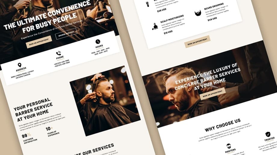
The most common misconception is that a "nice" website is automatically a good one — while in reality, a gorgeous, modern-looking site can be frustrating to use if the navigation is illogical, important buttons are hard to find, or the process the user has to go through is needlessly complicated. This is the phenomenon where the designer and the developer see how good the site looks, while the actual user, opening it for the first time in their life, simply can't find what they're looking for — because they don't know the logic in the designer's head, they only see what's in front of them.
This realization leads to one of UX's core principles: a good user experience isn't good because it's creative or surprising — it's good because it's familiar. Users expect the same pattern on most websites — the logo in the top-left corner leads to the homepage, the menu is at the top or side, the cart icon is visible in the top-right corner. When a website breaks these widely accepted patterns for the sake of creativity, the user has to relearn how to navigate every single time — and this kind of "cognitive load" is what makes people leave the site, without being able to articulate exactly what bothered them.
Where most money quietly disappears into bad UX
A bad user experience rarely shows up as a complaint — users don't email you saying "I couldn't find the contact button," they simply leave and find the next result. This is the kind of lost revenue that never gets recorded as a specific cause in any statistic — it only shows up as visitor count being fine but conversion staying low — and many attribute this to an advertising or content problem, while the actual issue is at the point where the decision would have been finalized.
One typical, frequently occurring UX mistake is neglecting mobile users: a site beautifully designed on desktop, but where buttons are too small, text too dense, and scrolling endless on mobile — while a significant, in many segments majority, share of visitors arrive from mobile. Another common mistake is too many decisions at once: a page trying to push ten different actions at the same time (sign up, follow us, check this out, read that) ends up not really convincing anyone of anything, because the user doesn't know where to look first.
How to tell if your own site has a UX problem
You don't need to become an expert to spot the most obvious UX problems. The most effective, free method is to ask someone who's never seen your site before — ideally not from your own team, because they already know the structure too well — to try to complete a specific task a real customer would do: find a given service, try to get in touch, try to buy something. Watch where they get stuck, where they click the wrong place, where they ask a question about something that seemed obvious to you.
The best UX test isn't you reviewing your own site — you already know it too well. The best test is someone who's never seen it before stumbling into it.
This practice, professionally called user testing, doesn't require an expensive tool or a long process — even two or three such observations usually reveal the most obvious, most conversion-costing obstacle. It's then worth making this a regular practice, before and after every major website change, because a small tweak that seems logical to you can easily introduce a new obstacle for people who don't know your own logic.
If you'd like to see where your visitors actually get stuck on your site, let's review your user journeys together.